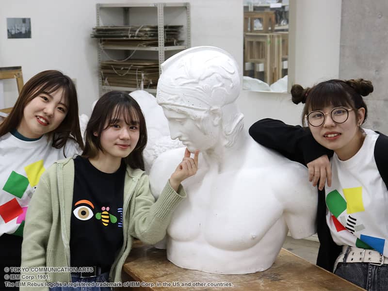
Following the end of World War II, two men from the United States used lettering and design to blaze a trail through a tumultuous era. The names of graphic designer Paul Rand and typographer Herb Lubalin may not ring a bell, but chances are, you would recognize their work. This UT collection takes a look back at the accomplishments of these two designers, whose work graces the T-shirts. We reached out to students at two art schools with a connection to Rand and Lubalin—Tokyo Communication Arts, for which Rand designed the symbol, and Cooper Union, Lubalin’s alma mater—to ask them about these T-shirts.
Paul Rand (b. 1914) was a legendary designer of corporate logos, known for his work in the 1950s and ’60s. Many of his designs are still in use today, including familiar logos for companies as varied as IBM, UPS, and ABC, the American television network. Rand once said, “The only mandate in logo design is that they be distinctive, memorable, and clear.” When a company’s logo—which acts as the company’s face—is designed on the basis of this philosophy, it may look simple, but it will possess an evergreen quality that is not easily forgotten.
Meanwhile, Herb Lubalin (b. 1918) broke new ground in typography through his work as a designer. Of particular note is his work for the art magazine Avant Garde, published in 1968 by editor Ralph Ginzburg. Lubalin pushed the limits of editorial design with each issue, experimenting with typography so freely that the magazine feels as fresh today as when it was first published. He also designed a striking typeface based on the magazine’s logo, which became popular immediately upon its release under the name ITC Avant Garde. Notably, this font was used in the logo of the original Japanese version of the Nintendo Entertainment System (NES) released in 1983.
The T-shirts in this UT collection celebrate the accomplishments of these men. They are a great way to examine the work of two remarkable designers who originated a style of graphic design that is currently enjoying a resurgence due to the popularity of retro designs.
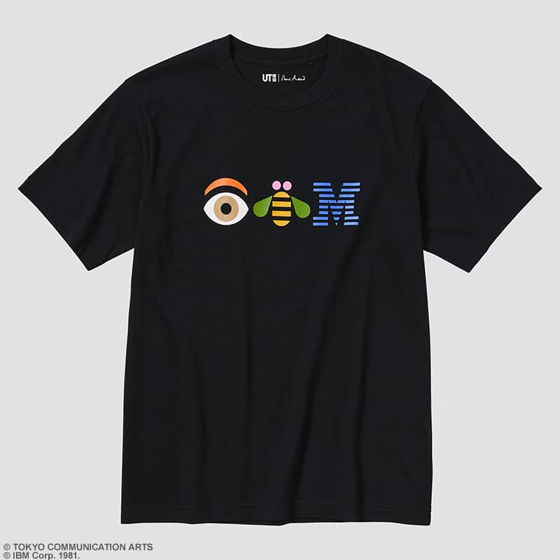
Rand designed this playful IBM logo in support of the company’s motto, THINK. The rebus uses images to represent sounds, with an eye for the letter I and a bee for the B.
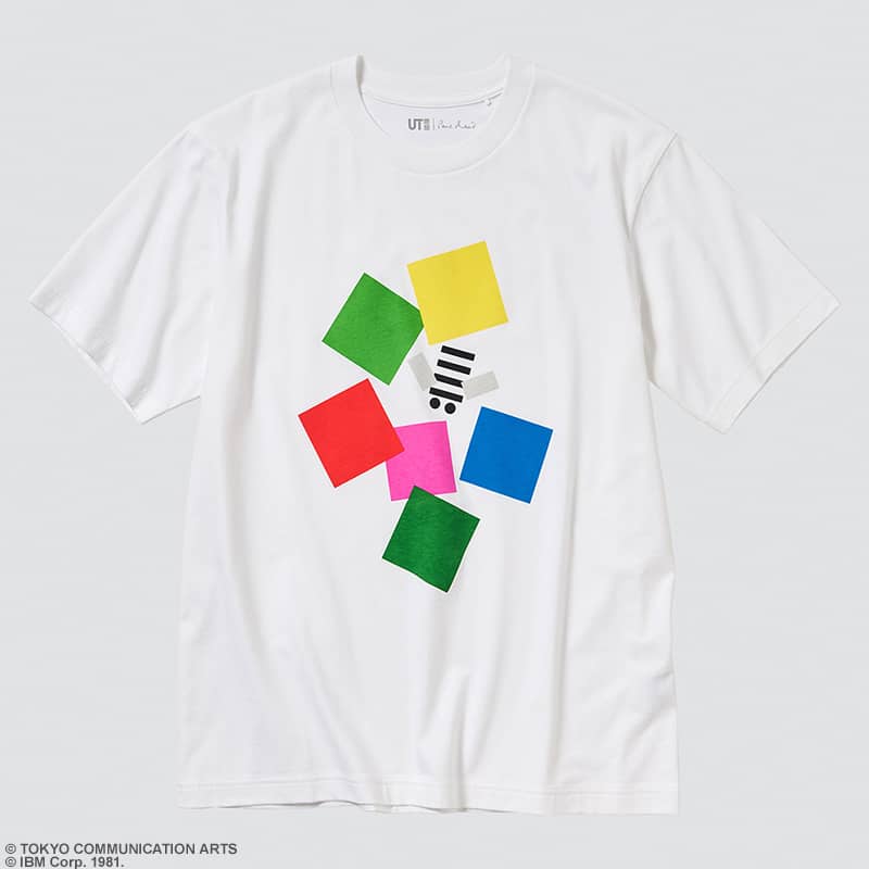
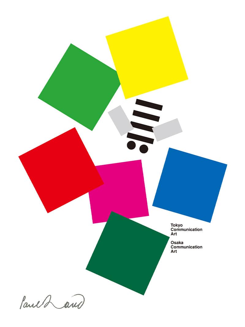
This symbol depicting a bee flying around colorful abstract flowers was created for Tokyo Communication Arts (TCA), a college where Rand once served as a consultant. Perhaps the bee is a metaphor for a curious student.
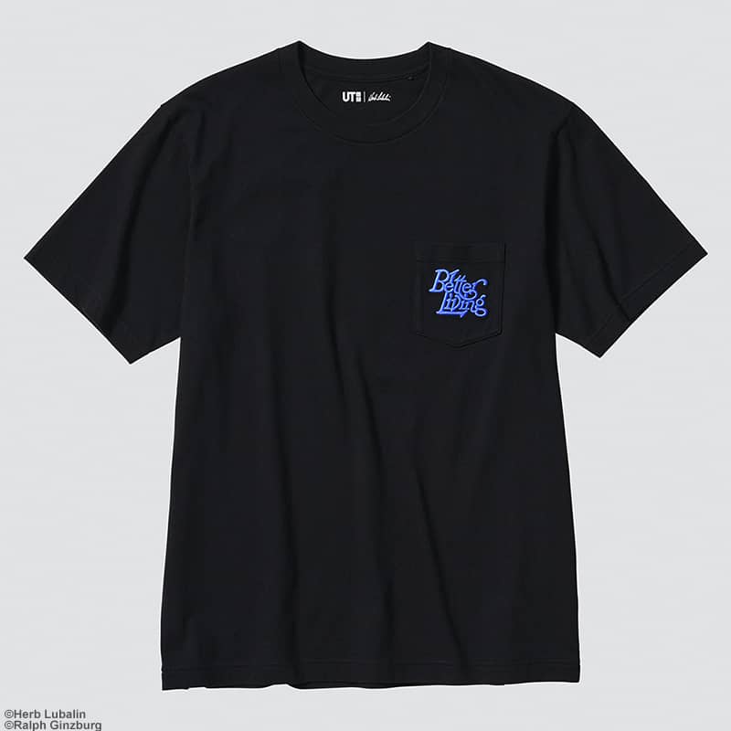
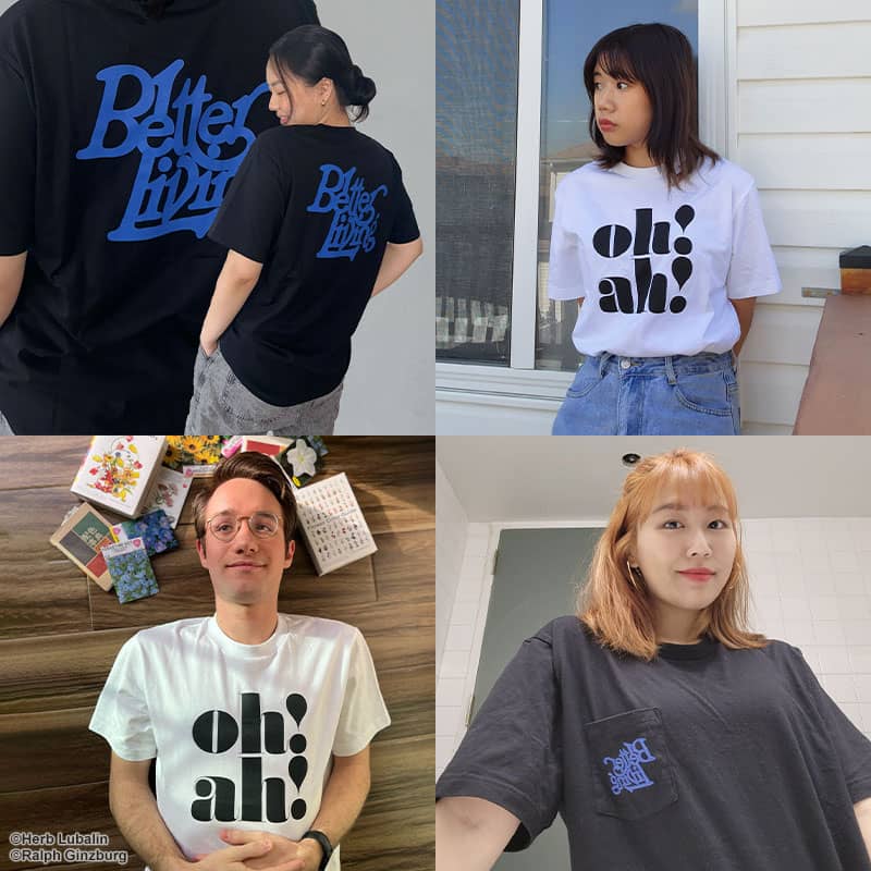
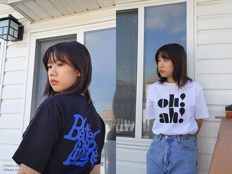
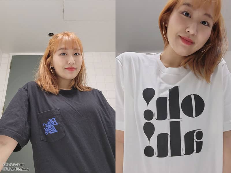
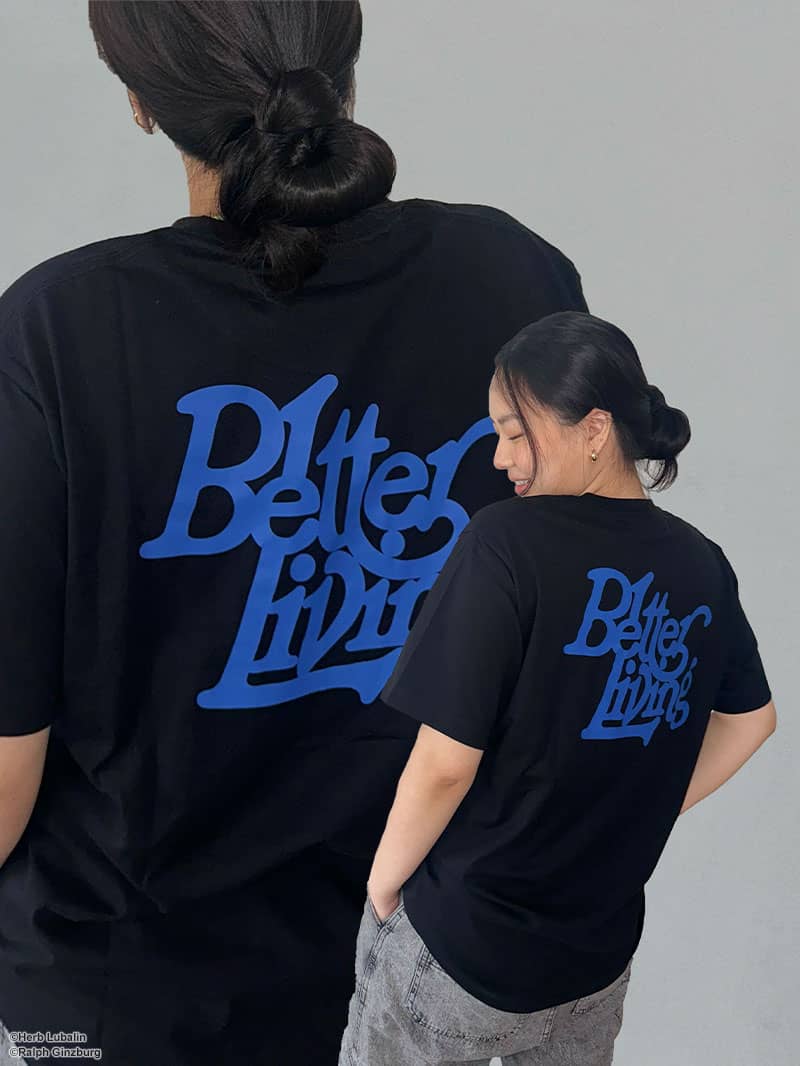
This is the logo of Better Living, a lifestyle magazine. Lubalin’s logo combines the letters in a complex yet elegant manner that epitomizes Rand’s philosophy of typography.
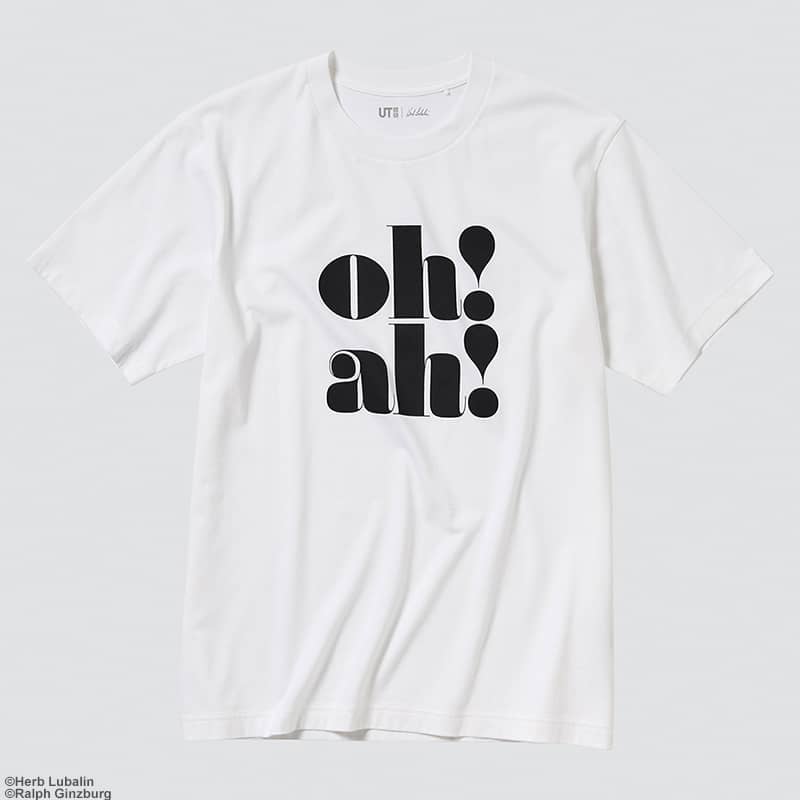
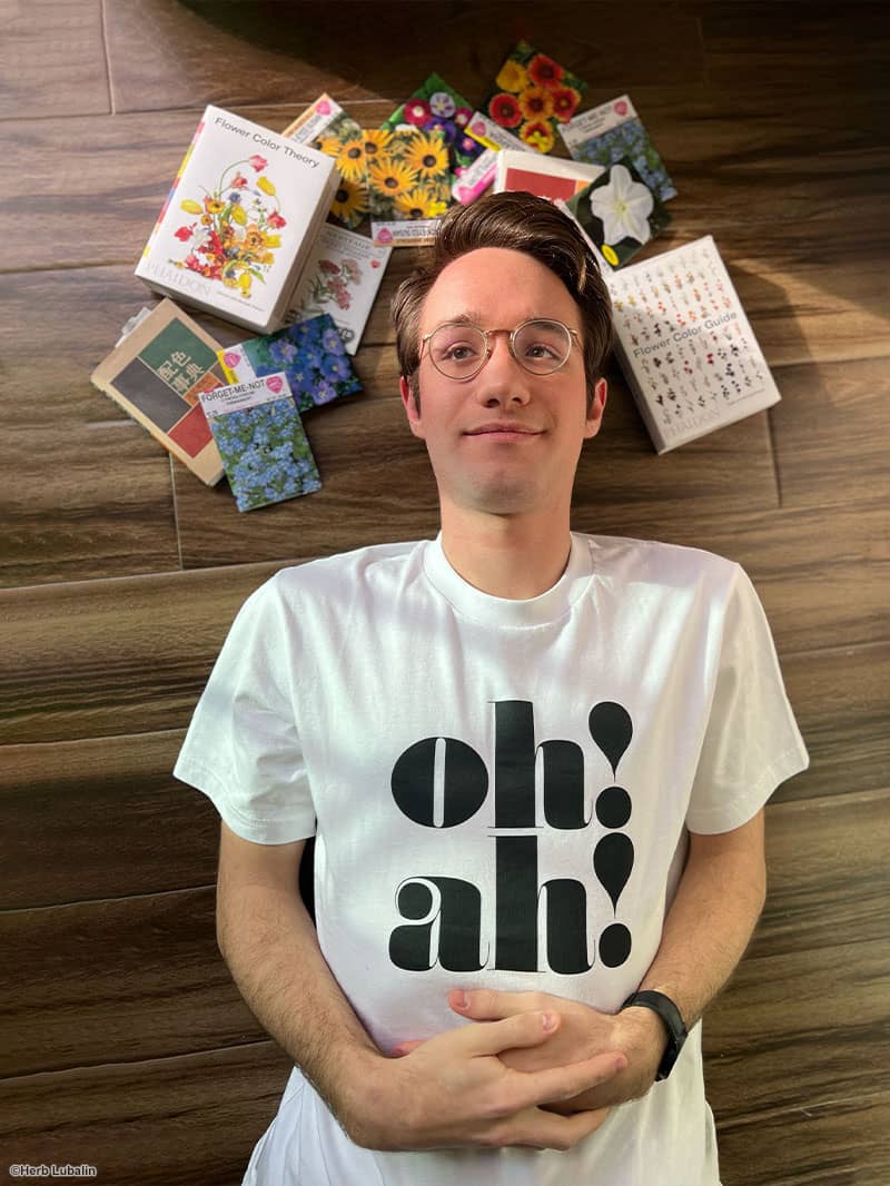
Lubalin designed this logo for the business cards and letterhead of Anthony Hyde, a photographer. The eye-catching design juxtaposes the last name of Hyde’s agent, Li-Lian Oh, with Hyde’s initials.
PROFILE
Paul Rand|Born in 1914 in New York, Rand began his career as a graphic artist after studying at several art schools. He soon rose to prominence, earning international acclaim for his numerous designs of corporate logos. In 1972, Rand was inducted into the New York Art Directors Club Hall of Fame in recognition of his achievements. He passed away in 1996.
PROFILE
Herb Lubalin|Lubalin was born in 1918 in New York and developed an interest in design after enrolling at Cooper Union. His particular fascination with typography led him to work as a typographer after graduation, creating many sensational and innovative designs. Even late in life, Lubalin was eager to publish new designs in the typography magazine U&lc. He passed away in 1981.
PROFILE
The Cooper Union for the Advancement of Science and Art|This private Manhattan college—whose name is typically shortened to Cooper Union—was founded in 1859 by industrialist Peter Cooper, who believed that an education equal to the best technical schools should be open and free to all qualified persons, regardless of their race, religion, sex, wealth, or social status. The school has produced many prominent alumni in addition to Herb Lubalin.
PROFILE
Yun / Student|Yun says that she spends the majority of her time at Cooper Union on graphic design and painting. Her current passion is communicating stories through her designs. “The story might be a political scandal, or it might be a funny object I found on the street,” she says. “I could tell my story in a manipulative way or in a straightforward way. Most importantly, being able to talk to people using the most powerful language—visual language—is what I love about design.” In her free time, Yun likes to drive around to refresh her eyes and brain. When it comes to the T-shirts in this collection, she says, “I love that they show off Lubalin’s conceptual typography. The T-shirts add flair to my outfit; they make me feel more like a designer.”
PROFILE
Richard / Designer|Richard, an alumnus of Cooper Union, currently works as a contract designer. He particularly connected with the coding classes at the university, recalling, “I think my inner nerd really blossomed when I took my first coding class there.” These days, he has been making use of what he learned at Cooper Union in his work as well as in his hobby of making generative artwork. He loves to push boundaries, explore new ways of working, and make things he never thought he could make. Richard wore the “oh! ah!” T-shirt, saying, “It feels great to wear a historic piece of design. This is a logo that carries a sense of giving. The story behind it is inspiring and is something that I carry with me every day.”
PROFILE
Melody / Student|One thing that Jun appreciates about Cooper Union is that the school “does not limit us with majors but rather allows us to explore all kinds of art and develop ourselves to become interdisciplinary artists.” Her interests are indeed wide-ranging. In addition to focusing her studies on painting, animation, graphic design (mostly logo and icon design), and illustration, she also has recently taken up book design and UI/UX design. Perhaps because Jun is so dedicated to her studies, her greatest hobbies during her time off are enjoying the slower moments and sleeping. Jun is particularly fond of the Better Living T-shirt, saying, “I think this T-shirt has a very pretty blue. The subtle pastel tone of the blue goes well with the black fabric and adds a bit of elegance to the letters. I would like to wear this as causal wear.”
PROFILE
Grace / Student|“I wanted to attend Cooper Union because the school gives students the opportunity to explore different genres of art,” says Grace, who is studying graphic design at Cooper Union and has a passion for digital drawing. “I don’t have a particular dream for the future, but I am looking forward to studying graphic design more after graduating from Cooper Union!” The elegant Grace—who lists making tea every morning as one of her hobbies—likes the typography of the Better Living design. “The fit of the T-shirt is comfortable too,” she says. “As a person with sensitive skin, I appreciate that the material is nice and skin friendly. I like how I can wear a T-shirt with pretty much anything. I would style this with jeans, cargo pants, or a long skirt with sneakers.”
PROFILE
Tokyo Communication Arts|Tokyo Communication Arts is a design school that opened in 1988. The school offers a curriculum that involves close cooperation with companies in the creative industry and has produced numerous professionals who are highly regarded in their fields. Unlike most two-year colleges, the school offers three- and four-year programs that allow students to fully immerse themselves in their education. The school’s symbol was designed by Paul Rand, who served as an overseas advisor for the school as well as for Osaka Communication Arts, an affiliate school.
PROFILE
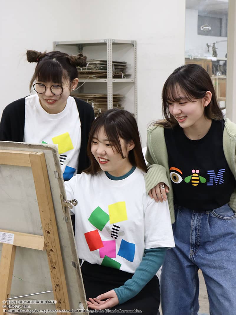
(Left)Rina Suzuki / Graphic Design Major, Creative Design Dept.|Suzuki chose TCA to study web design. Her dream is to become a designer and eventually start her own company. “It’s got a really Western design sense,” she says about the T-shirt. “Something the Japanese would really like. I might want to wear this underneath my suit when making a presentation.”
PROFILE
(Center)Noa Shigyo / Design & Technology Master Major, Super Creator Dept.|Shigyo was drawn to the school by the fact they offered a four-year program that would allow her to take her time to learn the basics of design and fine-tune her skills. She is currently studying graphic design. Shigyo feels that the Paul Rand graphic on the T-shirt is very much of its time. “I’d want to wear the shirt in a variety of styles for different occasions—sometimes with a pair of jeans, sometimes with a skirt,” she says.
PROFILE
(Right)Eri Takeuchi / Graphic Design Major, Creative Design Dept.|Takeuchi enrolled in TCA because she likes making things from scratch and wanted the opportunity to create many original works. “I can’t believe the school symbol was turned into a T-shirt,” she remarks. “But it might not be a bad idea to wear this while working. Wearing a T-shirt with a graphic by a master might help me come up with a great design!”
Release dates and prices may vary. Some items might be limited to certain stores or countries of sale or may be sold out.
© Herb Lubalin
© Ralph Ginzburg
© IBM Corp. 1981.
The IBM Rebus logo is a registered trademark of IBM Corp. in the US and other countries.
©︎ TOKYO COMMUNICATION ARTS
