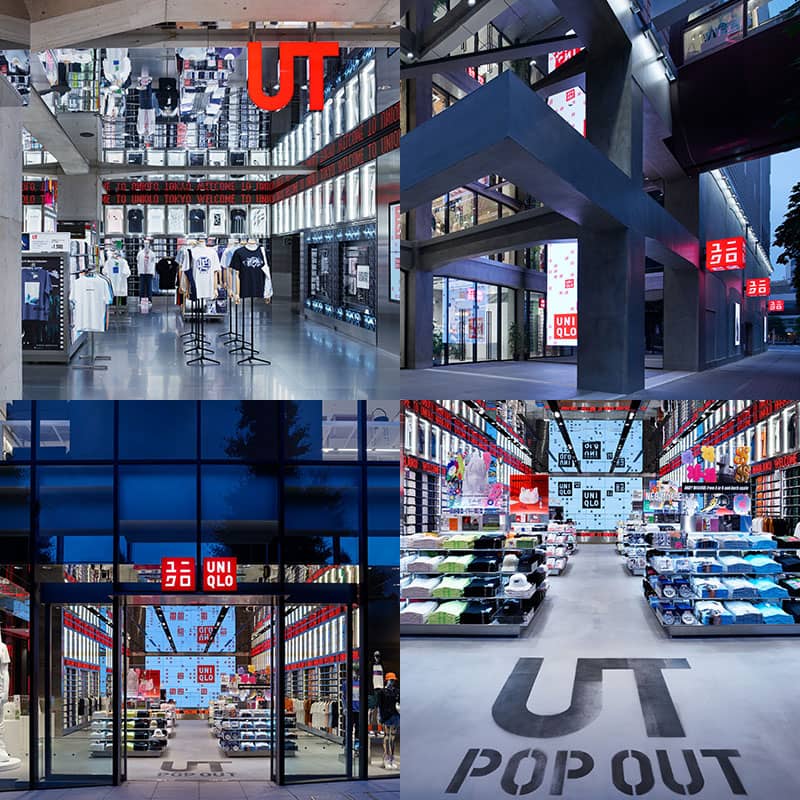
One of Japan’s top creative directors has organized his biggest solo exhibition yet. Giant corporate logos hang throughout the exhibition, conveying both the boldness of design and the beauty that can be produced by communication. As a finale, a UT Store has been placed at the end of the exhibition, transforming the shopping experience into art.
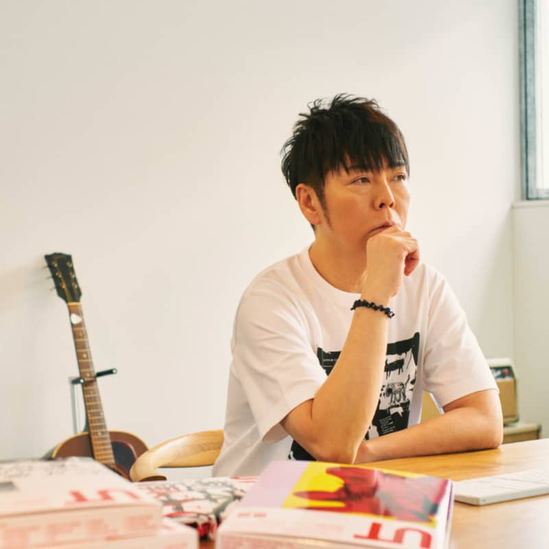
The National Art Center opened in Tokyo’s Roppongi district in 2007, becoming Japan’s fifth national art museum. It is surrounded by nature and features a wavy glass façade that glitters beautifully on a sunny day. Its minimalist logo— based on the kanji character shin (new) in the museum’s Japanese name—was designed by creative director Kashiwa Sato, who wanted to convey the museum’s goal of staying ahead of trends by always trying new things. Sato is also the subject of the museum’s latest exhibition.
“I always hoped to organize a solo exhibition here,” says Sato. “So I was overjoyed when they contacted me about it three years ago. For a national museum to give me this platform, it feels as if the country has acknowledged design as a culture in its own right.”
Sato says it took a lot of trial and error to figure out how to express his work in the form of exhibition displays. “Many of my results are intangible—strategies and concepts,” he explains. “So my activity itself is the artwork.” Sato’s designs make up only a portion of his work output. His main job is exploring his client’s issues to figure out how best the client can communicate the solutions with their consumers or users. Being effective in such a job requires long years of dedication to the client. In Sato’s case, he has worked with Uniqlo for fifteen years, with Rakuten for seventeen years, and with Seven-Eleven and Nisshin for ten years. To prepare for the exhibition, Sato pored over his past work and tried to identify a unifying strand—a story. The first work that Sato produced from this process was “The Logo.”
“To me, the logo is the most crucial form of corporate communication,” he says, “but it tends to blend into the background. So, I decided to transform corporate logos into huge, dynamic installations to remind visitors of their incredible presence. I approached each logo differently; for Uniqlo, I created a 3.5-by-3.5-meter (11.5-by-11.5 foot) oil painting. Each work is designed to look like a condensed bird’s-eye view of a city.”
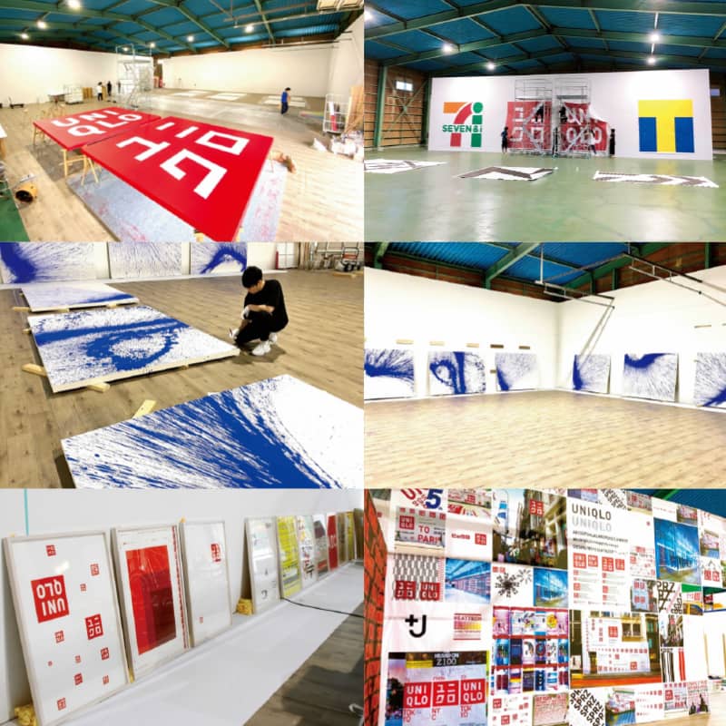
Sato says his love affair with logos began when he was a child. Visitors will get a sense of this as well when they see the collage—titled “Space”—at the start of the exhibition, which Sato made when he was just nine. “It’s my origin story,” Sato says. “I used to draw these abstract symbols all the time, and I loved logos and icons as well. My friends were into the latest sneakers, but I was more into the logos on the sneakers! I used to try drawing them on the covers of my textbooks. [Laughs.]”
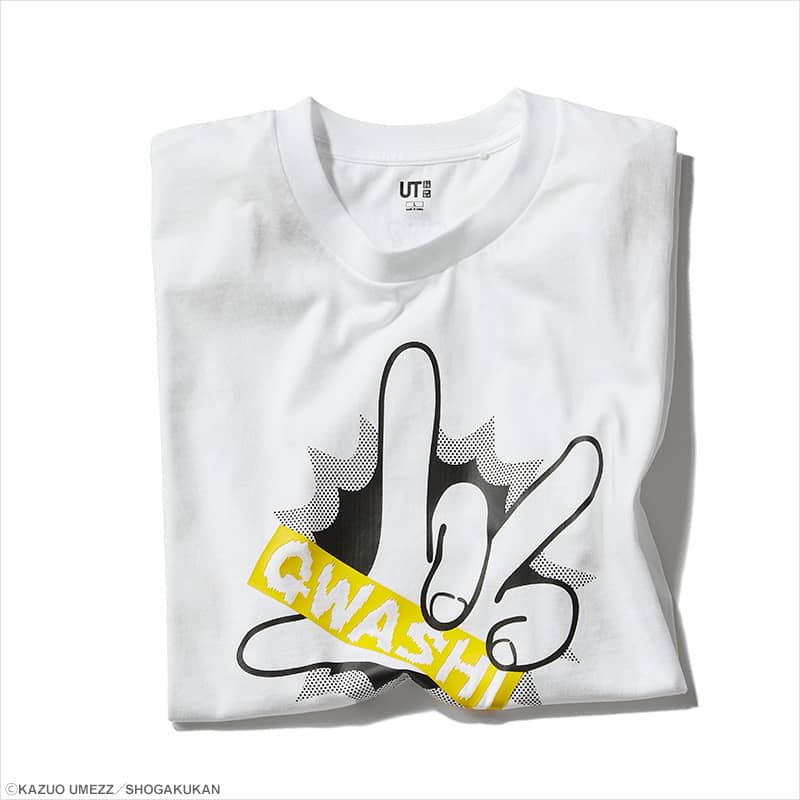
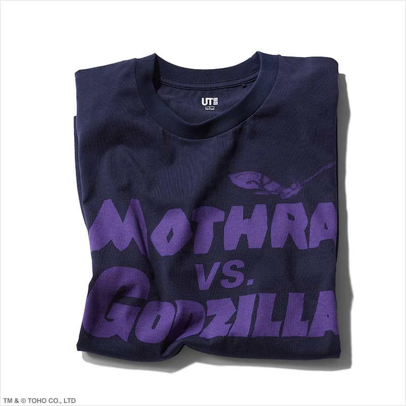
Located at the end of the exhibition is “UT Store @ The National Art Center, Tokyo.” It is an experimental piece that presents the very action of buying something as a work of art. (Visitors will be able to actually purchase the 27 UT shirts that are part of the piece and which Sato designed exclusively for the exhibition.) Each T-shirt comes in special packaging also newly designed for the exhibition. Those who want to collect all 27 shirts can purchase a box set decorated with the exhibition’s key visual, “Lines.” The T-shirts feature distinctly Japanese motifs such as anime, games, and ukiyo-e.
The motifs Sato chose are close to his heart. They include Devilman, a manga character Sato often sketched; Ultra Q, a Japanese TV show that features an antagonist, Garamon, whom he loves; and Jean-Michel Basquiat, who was his contemporary. The shirts themselves are lined up in a way that creates symmetry: for example, the UT featuring the sextuplets of the manga Osomatsu-kun standing in a line sits next to the UT featuring Andy Warhol’s Mona Lisa, which replicates the famous painting four times.
Sato says he eventually wants to take the exhibition around the world. But he has bigger dreams, too. “I want to create a public symbol,” he says. “Something everyone will recognize, like the Tokyo Tower. I also want to tackle the sky. I think the sky will be the next medium.”
PROFILE
Kashiwa Sato | Sato was born in Tokyo in 1965. After graduating from Tama Art University with a degree in graphic design, he began working at ad agency Hakuhodo. Sato left his job in 2000 and established Samurai Inc. He has worked as general producer of brand strategy for many of Japan’s top companies. In 2006, he designed Uniqlo’s corporate identity.
©2021 Pokémon. ©1995-2021Nintendo/Creatures Inc. /GAMEFREAK inc. © MARVEL © Disney ©/®/™ The Andy Warhol Foundationfor the Visual Arts, Inc. © Keith Haring Foundation. Licensedby Artestar, New York. © Estate of Jean-Michel Basquiat.Licensed by Artestar, New York. ⒸSOTSU・SUNRISE ©TSUBURAYA PRODUCTIONS ©Fujio Akatsuka ©MIZUKI Productions ©Go Nagai/Dynamic Planning ©2021 FUJIYA CO., LTD. © Nintendo
